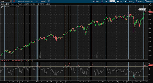
NDX and the RSI
We are in the midst of a run up off the weakness from September, followed by an October that showed the best gains since 2011. The NDX has been leading, RUT has been lagging. This is usual, most people say, for late stage bull market rallies. I do not know if that is true, but it sounds right.
Below is the 3-year daily graph of NDX plotted with a Wilders RSI in the lower chart area. I lined up the dates where the RSI entered the overbought area. In many cases, there was at least a brief period of pullback, or a slow down in the uptrend after the RSI peaked.
It is interesting to note that the SPX has not reached the RSI 70+ zone yet (currently around 66), nor has RUT (currently only 59). Their charts (not shown) do not show periods of weakness as dramatic or consistently as the NDX chart.
Once earnings flush out for the largest NDX members, the NDX may take a breather, and some short call or long put spreads maybe interesting.
